
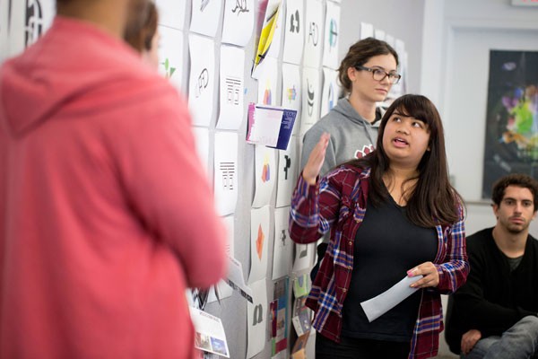
In the ART 303 “Experimental Typography” studio class, students got an experience of the design world from beginning to end. They were assigned the task of creating an identifying symbol for the College of Communication and Fine Arts. Working in groups of four, students researched consumer images and even words in order to decide what symbol would best describe the concept of CFA. Eventually, students created a symbol on their own in addition to discussing their work in class and making multiple revisions. The design process is essential because it gives students a chance to experiment, to learn from their mistakes and to build on the experience. “Design is not just about the final product,” said Saeri Dobson, assistant professor of graphic design at Loyola Marymount University. “The process is just as important.” A crucial component in the project came at the final stages: design presentations. Students presented their work to Dean Bryant Keith Alexander just as they would in a professional design agency and the dean offered his critique of the symbols. “This was a great opportunity for students to develop the skills they will need to succeed in their future careers,” Dobson said. “Experimental typography is another tool for communication. It’s like learning another language.”
Here is just a sampling of the student’s work:
Matthew Yamane, senior graphic design major
The interactions of the letters represent the interactions of the CFA departments. Using scale, I attempted to blend the letters cohesively together according to each letter’s form. For the font style, I chose a serif font type to represent the idea of tradition, because serif font types are associated with traditional styles of typography. I wanted to play with positive and negative space, letting one’s eye complete the rest of the form. The unseen parts of the C embody the idea that traditions cannot be seen in the present yet can still have an influence. Thus, the unseen practices of the past blend with the visible practices embodied in the F and A of the present.
Jazmin Infante, senior multimedia design major
The inspiration behind my logos was a photograph from the LMU archives. It captures the moment when negotiations about the merger of Marymount College and Loyola University began. I was drawn to the contrast between the iconic wardrobe of the Jesuit and Sacred Heart of Mary traditions. Consequently, I choose to explore the shapes of the nun’s coif and the Jesuit’s collar. My logo is merely an abstraction of these shapes and forms as they are combined and intertwined in a manner that distinguishes them, but does not negate either one. The end result is not a glaringly religious logo, yet it finds itself rooted in these traditions, much like CFA.
Michael Fullem, senior double major in graphic design and business marketing
When designing the logos to brand the College of Communication and Fine Arts, I delved deep into the college’s objectives and overall attitude. What I found was an extreme amount of diversity. Although the college is extremely diverse, I discovered that everyone is connected in some way, shape, or form. As students in the College of Communication and Fine Arts, we converge our backgrounds, talents, and intelligence to become a whole unit. For each logo I tried to take the new phrase “Where Traditions Meet” and convey it in an abstract form that people would understand. Each logo shows a convergence of all studies as one.
Sara Layon, junior graphic design major
The idea of using a foot as a base design plays off the statement “Making Our Mark.” Within CFA, we, as students of the arts, use our mediums to communicate our own messages to the world, hoping to make a lasting impression. The usage of the foot also implies movement. The usage of the intersecting eyes and the shattered pupil relate to the slogan “Where Traditions Meet.” Through the arts, students are bringing their point of view into the classroom and finding ways to express their experiences, hence the usage of the eye. The intersection and shatter are a portrayal of different parts coming together as a whole.
Caroline Bell, junior multimedia design major
My symbols are influenced by the idea of art and communication coming together. All of the departments in CFA have to do with communicating, but they all go about this in different ways, whether it be through dance, art, theater, history, music, therapy, or simply communicating. These are the ideas I tried to take and embody in my symbols. I tried to find one symbol that represented the arts and one that represented communication, and to bring these two together to form a unique symbol that represents them both, as well as the department and community of CFA at LMU.